Wednesday 5 December 2018

Stranger Things.


1. Who are the Duffer brothers? They are American film and television writers, known for creating the science-fiction show Stranger Things.

2. Analysis: genre: sci-fi
 Narrative: Set in the 1980s, science and sci-fi related; aliens, monsters, extraterrestrial life
   Intertextuality: Letters on the poster "abc" could connote letters on a ouija board - used to make contact with things in other realms
Historical Period it was set in: The 1980s judging by the clothes, the hairstyles and bikes

3. Based on the poster, the themes will definitely be sci-fi based as the character in the middle looks like she has supernatural powers due to the gesture she's making with her hand. We can also see the letters "abc" on a wall that signify the show will have supernatural elements.

4. Analyse the opening 10 minutes of Episode 1. What more can you conclude in terms of what the drama is about.
-three boys in the 1980s from a small town, deal with supernatural force

5. 80s movie references: Alien(monster inspiration), Ghostbusters(season 1), E.T(three kids on chopper bikes deals with supernaturality), IT(kids from a small town come together to defeat a supernatural evil), Poltergeist(kid gets kidnapped by a supernatural force) 

Ghostbusters (1984, ghostbusters save people from ghosts, in this case, the boys want to save the town from the supernatural)Related image
E.T 1982  (The friends meet an alien in this case Eleven and become friends with her.)
Image result for et stranger things
IT 2017 ( Couple of friends from a small town team up to deal with an evil supernatural force)
Image result for IT stranger things
Poltergeist (1982, a child gets kidnapped by a supernatural force)
Image result for poltergeist stranger things


Pick a theory – can you apply it
1. stereotype theory 
three boys: stereotyped as nerds
nancy stereotyped as a teenager who is concerned with simple teenage high school issues

2. character theory

3. identity theory


-

Friday 30 November 2018

Magazine
Date and Issue
 The Big Issue - A Suffragette Century Freda
 February 5-11-2018.


Analyse the connotations of the different elements of media language:
Elements of Media Language           
Analysis of meanings (including specific examples)
Overall layout/composition
 Homemade and vintage (40's looking) aesthetic, cut out looking - the homemade aesthetic is usually the overall layout for all Big Issue magazines. The homemade aesthetic can portray a sense of comfortability and make people feel more welcome. The 40's looking aesthetic may bring back a sense of nostalgia to the people who were born back in the 40's and hence, can relate to the magazine.
Masthead
 "A suffragette Century Freda" old looking typography, portrays that it dates back to perhaps the 40s/50s. Stands out the most from all of the other text, which instantly introduces what the whole magazine is about; the suffragettes who formed in 1903.
Cover lines
 "Her lifetime of incredible change" depicts she has struggled a lifetime of trying to get women rights and has gone through a 'lifetime' of change in getting those women rights.
Font size. Type, colour etc
 Large serif, dark purple-looking font, old/vintage typography - again creates a sense of nostalgia to the 40s.
Images/Photographs (shot type, angle, composition)
 A cut-out looking image of a woman, supposedly a suffragette, mid-shot, we can only see from the waist up, she is making direct address to her audience and is smiling - could connote she is happy about her accomplishments as a suffragette and has successfully gained women's rights. The background takes an appearance of an antique look that predates back to the 40s.
Mise En Scene
 Suffragette Freda at the front of the cover, making direct address - is the main focus on the magazine.
Antique/vintage looking background - connotes that it dates back to the 40s/World War 2.

­Language/Anchorage
 Anchorage is 'A suffragette', without it, we wouldn't assume Freda is a suffragette. Use of 'we' reinforces a sense of community.
Narrative established
 Freda is a suffragette who has lived a lifetime of incredible change into establishing women's rights.

How does the combination of elements of media language:
Communicate messages and values?


 Women's equality and women's rights - Took many years to establish this and the fact that it is established, is a big deal and still, needs to be talked about as enforcing women's rights was a challenge throughout the years.
Reflect the political/social/cultural context?


The Suffragette movement was political Suffragettes were members of militant women's organisations in the early 20th century who, under the banner "Votes for Women", fought for the right to vote in public elections, known as women's suffrage.
Establish the brand identity of the magazine?


  •  UGC/cut out looking aesthetic
  • Serif font
  • Vintage/antique looking background
  • Brown and purple colour scheme
Construct and appeal to its target audience?


 Elderly - make them reflect on the 40s.
Young women - learn about the history of the suffrage movement and how women's rights came about.

REPRESENTATION QUESTIONS
·         Groups/peoples/themes
•     How do these representations reflect the industry context/ ideology of The Big Issue?
•     How is the audience positioned in relation to these representations?
·         Is there any evidence of The Big Issue’s ethos of a ‘hand up not a hand out’ and reinforcing the message that the magazine is achieving its aims. Is there an increased focus on campaigning and political journalism?

·         Are a diverse range of people represented?  

·         Any empowering message that positions the audience to respond positively and align with this point of view?


Media Essay Practice - Suffragette Freda.


How do these representations reflect the industry context/ ideology of The Big Issue?

In this essay, I am going to examine the representations that are being portrayed in this cover of the 'Big Issue'. Firstly, in terms of the mis-en-scene, the overall structure of this front cover takes on an appearance of a very vintage 40's looking style, with a home-made aesthetic, which is a typical norm of the Big Issue magazine. The homemade aesthetic is particularly effective as the aesthetic can portray a sense of comfortability and make people feel more welcome. The 40's looking aesthetic may bring back a sense of nostalgia to the people who were born back in the 40's and hence, can relate to the magazine and look back at the time in the 40s. Next, we see the big and bold masthead 'A suffragette Century Freda" which holds an old looking typography and may portray that it dates back to perhaps the 40s/50s. We can further see that it stands out the most from all of the other text, which instantly introduces what the whole magazine is about; the suffragettes who formed in 1903 and have battled their way for women's equality for years. Below, we see the cover lines: "Her lifetime of incredible change" which depicts she has struggled a lifetime of trying to get women rights and has gone through a 'lifetime' of change in getting those women rights, which again, is effective as it emphasises how hard it was for her to achieve this. The typography, as mentioned earlier, is very old and vintage looking; large serif, dark purple-looking font, old/vintage typography, which again creates a sense of nostalgia to the 40s. The choice of purple is cleverly used, as the colour purple can hold connotations of pride and independence, which is certainly what the Suffragettes were about. Most importantly, in this informative front cover, we see a cut-out looking image of a woman, supposedly called Freda and a suffragette, in a mid-shot, where we can only see from the waist up and is seen making direct address to her audience and is smiling, which could connote she is happy about her accomplishments as a suffragette and has successfully gained women's rights and also the background takes an appearance of an antique look that definitely predates back to the 40s.

Secondly, in terms of the overall messages and values being communicated is very obvious; it's all about women's equality and women's rights -that took many years to establish this and the fact that it is established, is a big deal and still, needs to be talked about as enforcing women's rights was a challenge throughout the years. Furthermore, in terms of other important factors, such as political/social and cultural context, the Suffragette movement was a political movement and the idea of suffragettes were members of militant women's organisations in the early 20th century who, under the banner "Votes for Women", who fought for the right to vote in public elections, known as women's suffrage. In terms of the target audience, it's very likely that this is aimed at the elderly, perhaps to reflect back on the big achievement of getting women's rights and perhaps young women, to learn about the history of the suffrage movement and how women's rights came about.

In conclusion, I think that this front cover of the Big Issue is very positive and lovely, it indeed does show a powerful connotation on women's rights and how it was hard to achieve it through all those years. The fact that we see Freda smiling here portrays her happiness and how proud she is of how women's rights was finally established, and it is important to also learn the history of the suffrage movement as it was incredibly popular and challenged social, political and cultural factors. 

Tuesday 27 November 2018

BBC radio contexts table!


Cultural
Economic
Political
Definition:
relating to the ideas, customs, and social behaviour of a society.

Definition:

relating to economics or the economy.
Definition:

relating to the government or public affairs of a country.
Brainstorm cultural context of radio:

Its headquarters are at Broadcasting House in Westminster, London and it is the world's oldest national broadcasting organisation

The BBC is established under a Royal Charter and operates under its Agreement with the Secretary of State for Culture, Media and Sport 

Offers new music and popular styles

BBC Radio 1Xtra sisters Radio 1, and broadcasts new black music and urban tracks

Brainstorm economic context of radio


They cover a lot of the UK economy
Brainstorm political context of radio:

The BBC is meant to be politically impartial and to abide by anti-bias laws

 Debate over this; supposedly right-centred,

Wednesday 21 November 2018

How does the Radio One Breakfast Show reach its audience?

How does the Radio One Breakfast Show reach its audience?  


The Radio One Breakfast Show reaches it's audience through its Mission, Values and Vision. For example, it's mission is to to inform, educate and entertain. It's values is they are independent, impartial and honest. They care about their audience. They also take pride in delivering quality and value for money and also respect each other and celebrate our diversity so that everyone can give their best. For its vision, it's the biggest integrated multimedia broadcast and production group of its kind in the world, launched with a mission to create great programmes for audiences in the rapidly changing digital world, and we can all agree that the BBC indeed does accomplish these three factors. 

In terms of other ways how it reaches it's audiences is through the different platforms that they have. So, for example, one way it can reach is through the BBC breakfast website. Users can get around it easily as it has a live radio, so they can listen to it online, instead of watching it on the TV. It also has a BBC iplayer where people can watch shows of their choice. Another great way to reach its audience is through their own youtube channel, which on it, has playlists that are likely to appeal to its target audience. For example, playlists of Teen Awards, Live Lounge and the Biggest Weekend can be found on there. Further, it also has BBC sounds, where users can get to pick which live broadcaster they want to listen to, for example, they can listen to Nick Grimshaw, MistaJam, etc. The target audience can also pick from the 'hot podcasts' section and listen to different music mixes of their choice, which personally, is a great idea and a good way to appeal to the audience. Furthermore, it also has other platforms like Instagram, which again, is a good way to reach the target audience as Instagram is an extremely popular app; users can get to look at the latest posts to see what happens recently, they can also look at the highlights on their profile. 
Another successful way it reaches its audiences can be seen through Rajar. RAJAR stands for Radio Joint Audience Research and is the official body in charge of measuring radio audiences in the UK. It is jointly owned by the BBC and the Radiocentre on behalf of the commercial sector. 49.1 million adults or 90% of the adult (15+) UK population tuned in to their selected radio stations each week in the third quarter of 2017, which just shows how successful BBC actually is. For the younger audiences, 9 to 14, 74% listen to Radio weekly, 75% of young Radio listeners use Social Media, but only 18% claim to use Podcasts weekly. 

The Big Issue intertextuality question essay.

Analyse why The Big Issue magazine has used an intertextual approach on its front cover. In your answer you must:

  • analyse the use of intertextuality to create meaning in the source

    • make judgements and reach a conclusion about the advantages of this use of intertextuality to The Big Issue magazine.


In this essay, I'm going to be examining the use of intertextuality in this The Big Issue cover to see what meaning is being created, as well as make judgements and reach a conclusion about the advantages of this use of intertextuality.

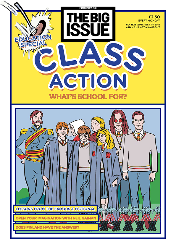
Intertextuality is immediately introduced in the structure of this front cover; funky and old-school looking as it takes the appearance of Grange Hill, which is a Children's drama looking at life in a London comprehensive school, which would certainly appeal to the target audience, which would be the students and perhaps teachers. However, in this cover, the element of intertextuality is clearly introduced through other components, such as the different characters that we see in this front cover; Harry Potter, Ron Weasley and Hermione Granger. The reason why Harry Potter is introduced here is because as this Big Issue cover is about education, Harry Potter conforms to that, except it gives education positive connotations; magical, bright and optimistic, as in the Harry Potter series, Hogwarts is connoted as a school that every child would want to go to, as it's very flexible with the rules and its students, which is a complete contrast to normal schools today. Further, we can see other characters in this cover, such as Ozzy Osbourne who is a very known English vocalist, but is also known for having Dyslexia and not being understood back in school at the time, and I think that issues like that should be addressed, especially when it comes to education, because it shouts out a sort of awareness, and the fact that people with Dyslexia should be understood and helped, instead of being casted out, like Osbourne was. Moreover, in this cover, we can also see Pink Floyd's use of 'another brick in the wall' which essentially, is a song about how education creates clones and restricts complete freedom, and in some perspective, that is true. Some may argue that education does prevent freedom and self-expression. Next, in this cover, we have the main character, Offred, from the Handmaiden's Tale, being represented here, which could reflect the education system; the fact that it is extreme and it is in an authoritarian state, where people have no say, or in this case, students have to do what they're told, which again, is a statement that is true in most education systems. We also see other, not so prominent characters in this cover, such as Jean Brodie, where she believes education is more than curriculum, it's also personal, as Jean Brodie gives her students lessons about her personal love life and travels, promoting art history, classical studies, and fascism. Under her mentorship, these six girls whom Brodie singles out as the elite group among her students—known as the "Brodie set"—begin to stand out from the rest of the school. In addition to this, we can see Benedict Cumberbatch, who went to public school and had an art scholarship, he also displayed interest in rugby and painting, however, it was the theater/acting that captured his interest most of all, and said he didn't enjoy all of the experience, which could portray that students may lose interest in the things that they thought they wanted to study and find something else that they're interested in. Lastly, we can see the character Flashman being portrayed in the cover, who is a notorious bully at Rugby school and persecutor of Tom Brown, this again, represents a key issue in education; bullying, and that there needs to be a stop to it.

In conclusion, I think that there are many advantages, rather than disadvantages, in this cover, so for example, the main advantages is that, it's revealing the truth of what the education system is and what it SHOULD be; Harry Potter, the education system should be magical and fun to be around in, not the opposite, like Pink Floyd's 'another brick in the wall', where students get turned into 'clones' and where freedom is restricted, as well as self-expression. The fact these issues get addressed, is very positive because it'll help schools understand their pupils better and even get them help, which was the opposite of what Osbourne's school did, since he suffers from Dyslexia. In my opinion, mental disorders should definitely be more addressed in school and in general, because mental issues have been considered as a taboo subject for many years, and many people wouldn't talk about it and wouldn't explore the issues within, which again, shouldn't be the case because more and more people suffer from mental disorders everyday and nothing gets done about it. In terms of other advantages, Pink Floyd's 'another brick in the wall' is, in my opinion, a perfect representation of what some schools are like; turn the students into clones and robot-like objects, with freedom and self-expression restricted. Which again, is not how schools are supposed to be. Schools should be more enjoyable and more flexible with its rules and students, that way students can enjoy school life more. As for the character Offred, I think it's also an advantage of her being represented here, it reflects the authoritative and extreme society and education system we live in, where men are in power and women are inferior to them. However, the same could be said when applying to education; students have no say, they have to do what their teachers tell them to. In terms of Jean Brodie's view of schools having to be more personal instead of curriculum, I would say I fairly agree with her. It'd be quite interesting to have the two 50/50, where it's curriculum as well as personal, where students can get to know the teachers on a personal level as well as a professional level, and I think that would be an advantage because it would make students feel more comfortable in the space that they're in. In addition to this, with Benedict Cumberbatch, it's important to know what people themselves want to study so that they can have the best experience. Lastly, Flashman, a fictional book character, and a notorious bully, highlights one of the most important key issues in the education system; bullying. Bullying is not a very assessed key issue in most schools, which should change because bullying leads to a lot of mental health issues and again, nothing gets done about it. To summarise, I think it's an advantage that they've used these key characters to represent the education system, because it's a shout out to what needs to be done and what needs to be changed. 

Tuesday 13 November 2018

Big Issue Question due Wed.


How does the Big Issue cover you have studied use media language to construct an alternative representation of an event / group / issue? (10 marks)
What could you include:
  • Image- connotations, choices, how it addresses the target audience (and who are they), how we read the image
  • The text- what choices have been made and how do they interact with the image?
  • Context- the event/ group/ issue being portrayed and its relationship to social / cultural / political events
  • How it is different or similar to other covers we have looked at


In the cover of The Big Issue, with the use of Barthes and Semiotics theory, we see Paddington being denoted in the center wearing a blue coat with a luggage bag in his hand, who is also seen to be waving to the target audience - we also know this as he is looking directly into the shot, creating direct address. As we can see,the overall layout and composition of this influential cover is, it consists of a blue and yellow scheme, a cover line n the middle and a focal point to Paddington, which could connote that the audience should be paying attention to him , as he is also possibly the anchorage here. The masthead here also contrasts with the background, which makes it more appealing for the audience. Further, the magazine's cover line says "One of us" and since Paddington is the center of the attention here, the cover line can reflect the fact that since he is an immigrant, there are also vendors who are immigrants, this can also be signified by the pronoun "us", as it is inclusive. As a whole, the narrative of this cover established, is the fact that the bear - Paddington, is a metaphor for vendors; homeless people and immigrants. Not to mention that the overall style of The Big Issue has its own brand identity; the home-made aesthetic, which is inter textual and synergistic to homelessness. 


The clear message it's giving here is migration and immigration. It also reflects homelessness in a happy and warm way by the use of the metaphor - Paddington, as he is a bear and is friendly and warm. In terms of political and social context, again, the idea of the message here is about the concerns of immigration and the big idea of Brexit and how voters are against this idea as it raises issues/concerns of immigration. However, this doesn't only target that specific type of audience, it also appeals to children and families, as they've used a symbol of love and warmth - Paddington and this can further be emphasized by the theme aswell, which is Christmas, which again, holds connotations of love and warmth. 

Sunday 4 November 2018

The Big Issue Magazine.

F A C T S
  • First published in 1991
  • Most widely circulated street newspaper
  • Hybrid genre (entertainment and social business)
  • Entertainment aspect attracts advertising revenue
  • Editorial content is often critical of big business, banking and champions the political cause and role of the individual within society
  • Costs £2-50 / £1-25 goes to the trader
  • John Bird's idea because he was homeless
  • Vendors buy it half the price.
  • Focuses on Social, Cultural and Political Contexts
  • over 200 million copies sold
  • thebigissue.com, subsidiary
  • big issue invest
  • Lord John Bird - helped many homeless people
  • It focuses more on the left (labour) side as it came from the left wing.
  • It supports the less wealthy
  • Founder (John Bird) comes from poverty/homelessness, however many conservatives are self-made business people, come from poverty & want to keep their wealth.
  • "social exclusion" - some people sit completely outside the mainstream society e.g homeless people.
  • UGC, user-generated content, home-made aesthetic.

Homework

Metro - The Big Issue magazine: Helping the homeless for 23 years


  1. despite his efforts, none of them seem to acknowledge his existence.
  2. The Big Issue is sold by street vendors across the country who buy copies from the publisher for £1.25 and sell them on the streets for £2.50
  3. He became homeless eight years ago after he lost his job and his flat and has spent time in prison for a drugs-related offence.
  4. Funded by donations and grants, it works to help the magazine’s vendors to secure housing, training and healthcare. Nearly 100 people a week turn to it in times of need.
  5. Having sold about 140,000 copies a week during its peak in 2001, it now distributes 100,000 a week across Britain through 2,000 vendors.
  6. instead of giving £2.50 for the magazine, people are giving a fiver. So what’s actually happened is that a lot of vendors might sell 20 papers a day and yet they will make enough money to live because they get the money for 30 or 40 papers. The amount of money on the streets is higher than it’s ever been
  7. Its eyes are set on making the government aware that its welfare system doesn’t reduce poverty and campaigning for the living wage. On the editorial side, the magazine is looking to turn its vendors into online contributors through a project called The Big Answer.
05/11/18.

-UGC aesthetic, user-generated content.
-images are usually unconventional
-glossy covers


Magazine
Date and Issue
Paddington
Analyse the connotations of the different elements of media language:
Elements of Media Language           
Analysis of meanings (including specific examples)
Overall layout/composition
Blue and yellow colour scheme, with Paddington in the sight of the Big Ben waving, he also has a suitcase in his hand, which could portray migration. The text surrounds him.
Masthead
The Big Issue
Cover lines
"migrant British icon, one of us"
Font size. Type, colour etc
Font size is quite big, sans-serif, yellow
Images/Photographs (shot type, angle, composition)
Front cover of Paddington, long-shot,
Mise En Scene
Set in central London; Big Ben in the background,
­Language/Anchorage
English language, anchorage would be Paddington, if he was not there, then we wouldn't get the message.
Narrative established
How does the combination of elements of media language:
Communicate messages and values?
Paddington is in the front cover of the magazine,which portrays a message on migration;
A young Peruvian bear travels to London in search of a home. Finding himself lost and alone at Paddington Station, he meets the kindly Brown family, who offer him a temporary haven. So, 
Reflect the political/social/cultural context?
Establish the brand identity of the magazine?
Construct and appeal to its target audience?
REPRESENTATION QUESTIONS
·         Groups/peoples/themes
•     How do these representations reflect the industry context/ ideology of The Big Issue?
•     How is the audience positioned in relation to these representations?
·         Is there any evidence of The Big Issue’s ethos of a ‘hand up not a hand out’ and reinforcing the message that the magazine is achieving its aims. Is there an increased focus on campaigning and political journalism?
·         Are a diverse range of people represented?  
·         Any empowering message that positions the audience to respond positively and align with this point of view?