Showing posts with label Advertising & Marketing. Show all posts

Wednesday, 9 January 2019

Shelter Campaign analysis.

Image result for shelter campaign advert

Mis-en-scene


  •  Shelter campaign targets homeless people.
  • Vulnerable housing, unstable housing
  • Targeted at people who are at risk/facing the struggles of keeping a home, they try to stop them from becoming homeless.
  • Message is to seek help for Shelter before they lose their homes, e.g people who are facing debt and cannot repay the amount, rogue landlords and people who are losing their jobs.
  • Search bar at bottom (baseline) search advice.
  • Close-up shots of these faces to see their facial expressions; sad, weak, vulnerable, worried
  • Red sans-serif text could connote danger, desperation, urgency
  • Direct address signifies the need of help from the audience.
  • Target audience: middle age,  both male and female, white
The social / cultural / political contexts we will focus on are: 
  • Shelter as a charity > > > >
  • The Advertising Standards Authority (ASA) and its regulatory framework
  • The government’s comprehensive spending review of 2010, in which spending on social housing was cut by 60%, with a catastrophic impact on homelessness. > > > > 

  • Amplify = advertising agency who produced campaign for Shelter.
  • Amplify works with Shelter so that they can persuade people to seek help early.
  • It is realistic and relatable.


The ASA are the regulatory body for advertising in the UK.

  • Set strict rules about advertising
  • They have the power to “pull” any adverts that have been complained about by a member of the public or a company.
  • They will investigate complaints and agree / disagree
  • Advertisers have to adhere to ASA guidelines
How is media language used in the Shelter advert? Refer to the social, political and cultural contexts in your response [15 marks]
Image result for shelter campaign advert
The overall layout and composition of this campaign is different compared to other adverts. For example, not many adverts have close-ups of peoples' faces and text over it. This advertisement subverts to the many conventional codes that many adverts normally use. The masthead is painted over the three peoples' faces, in red with different text each time. Using Barthes' Semiotics theory, the red sans-serif could connote danger and desperation, which is what these people are seen facing and as the Shelter campaign is all about preventing people from becoming homeless; it's aimed towards people who have vulnerable housing or unstable housing, or they're at the risk of losing their homes. The sans-serif typography could also signify that it's aimed at everyone, not just men, but also women and the fact that it is capitalised, signifies that they're perhaps screaming for help. Moreover, in the mis-en-scene, we can see three people; two women and a man, who all look weak and vulnerable, which signifies, again, that it's aimed at all genders and all ages. The use of direct address could connote how they're asking the audience to help them, or in this case, the campaign to stop them from becoming homeless. The narrative established here is that the people here are asking for help, hence the direct address and the red sans-serif typography, that portray danger and desperation; a need of help. 

In terms of messages and values being communicated, the clear message of Shelter campaign is that again, it's aimed at people who are about to become homeless, they're struggling to keep their homes, and the Shelter campaign is there to prevent those people from becoming homeless and sleeping rough on the streets. Furthermore, reflecting some of the social context, Shelter campaign is ruled by the Advertising Standards Authority (ASA) and its regulatory framework and the ASA is a non-statutory organisation and so cannot interpret or enforce legislation. If people do not like a specific advertisement, then the ASA would have a look into it and if it breaks one of it's legislations e.g "avoid presenting an exaggerated impression of the scale or nature of the social problem to which the work of the charity is addressed, eg. by illustrating the message with non-typical extreme examples" then the ASA would have the right to take down the specific advertisement.

In conclusion, this advertisement is successful in portraying its cause properly without breaking the ASA regulations, such as the fact that it does not overexaggerate homelessness, it portrays it sensibly. In my opinion, there should be more advertisements like this so that the issue of homelessness could be addressed quicker, and also prevent people from becoming homeless; those who have vulnerable housing, unstable housing or they're at a risk of losing their homes. The mise-en-scene and the typography also signify its cause e.g the red and bold typography, the close up shots of the three people, whose facial expressions are seen as weak and vulnerable, that also show that the advert is powerful in delivering its cause. 

Monday, 7 January 2019

Homework - Gareth Bale Lucozade Advert Analysis.

Lucozade advert plan:

  • "In a different league" Gareth Bale
  • Gareth Bale, Real Madrid/ex Tottenham Hotspurs / Welsh
  • Clean cut image
  • "In a different league" - an expression which suggests superiority, lucozade is better than its competitors (slogan)
  • Also the slogan literally suggests that Bale does not play in premiership but La Liga + hes a great player!!
  • Barthes - Myth (mythical masculinity)
  • Sexuality that's instantly recognisable
  • reflects cultural ideals
  • strong, confident, physical presence
  • Lucozade: strong, trustworthy, sports performance.
  • Branding: blue and yellow colour scheme, lucozade yes graphic on the bottom left.

--------------------------------------------------------------------------------------------------------------

Image result for gareth bale lucozade


In this Lucozade advert, we can see a mid-shot of the famous footballer, Gareth Bale, who is seen to be making direct address with the target audience, he seems to look sweaty, which, with the use of Barthes Semiotics theory,  connotes that he is an intense and professional footballer player. Next, we see the cover line "In a different league" which signifies a sense of superiority and that Lucozade is better than its competitors, but also in the mis-en-scene, we can see the obvious blue and yellow color scheme, which again, could hold connotations of superiority, power and energy, which is what Lucozade is supposed to make the audience feel. We can also see a close-up of the Lucozade product, which is called "Lucozade Sport" which illustrates that the drink is mostly aimed at people who do sports, so that the drink could empower them, motivate them and give them energy. However, in terms of representation, Gareth Bale here, is being represented as someone who has mythical masculinity, and we can derive this from Barthes, as he believed that there were many mythical things on the internet for example, things that seem real on the internet but are not. Over here, he is presented as someone who is masculine and the audience is supposed to perhaps look at him and become this masculine, which, in my opinion, is a negative representation.

In terms of the messages and values being communicated, it is clear that "in a different league" signifies superiority and that Lucozade will give you power and motivation to continue being a sports person, like it did to Gareth Bale, as this can be supported by how sweaty and serious he looks in the cover. So if the audience chooses to buy this product, it is clear what they will get from it. Further, in terms of other elements like context, Gareth Bale is a well known and respected footballer who plays in La Liga. 

In conclusion, I believe that this cover is quite persuasive in terms of trying to get the audience to buy the product, because it clearly portrays what would happen if sports people consumed the product; they will feel more energetic and motivated.  


Sunday, 6 January 2019

Old Spice magazine/poster analysis homework 07/01/19.


In this cover of 'Old Spice' the overall layout and composition is fairly simple; landscape with a cover star in the center and little amount of text, without a masthead. However, in the overall mis-en-scene, we can see the cover lines instead such as "Old Spice Bahamas comes from an antiperspirant mine in the Bahamas" and then "Old Spice" which using Barthes Semiotics theory, could signify that without the masthead, perhaps they wanted to get to the point and tell us what the product is about, however, how would the audience be able to identify the product properly without the actual masthead of the cover? Further, the typography in this cover is fairly small and san-serif, meaning it could connote masculinity and strength. In terms of what is inside the actual mis-en-scene, we can clearly see a dark male cover with a metaphor of a volcano replacing the top of his head, and this of course, could perhaps signify him as someone who is "hot" if they use the Old Spice product; they would be deemed more attractive if they use it. This idea can also be corroborated by the fact that around the cover pupil, he is surrounded by people who are enjoying themselves and having fun. It can almost be said that the cover of this product takes an appearance of Surrealism, making things look realistic but not at the same time. In terms of other things like the anchorage here, it would seem that one of the cover lines: "Old Spice Bahamas (...) This fact has not been fact-checked" would be the anchorage because without it, the audience wouldn't really be to identify the product and what it does or what it's supposed to be. The main narrative of this advertisement, I think, is to persuade the main demographic audience of males 19-25, to buy the product so that they could feel better about themselves and appear more attractive or "hot" as the volcano signifies.

Moreover, in terms of the messages and values the cover communicates is again, making the target audience feel better about themselves, raise self-esteem, so that they could smell fresh and attractive after using the Old Spice product, it's an "outdoor campaign using tiny figures as a visual metaphor for how great you will smell using Old Spice." which is exactly what the cover portrays. In addition to this idea of surrealism, this advertisement also portrays the idea of postmodernism; where anything can be art, that the 'reality' we live in, is defined by images, stereotypes and different representations of things, and this advertisement clearly portrays that. The idea of postmodernism displays a state of simulacrum; it plays on its audience by the fact that they know these types of advertisements are cheesy, yet they work. The element of postmodernism paints a type of mix and match aesthetic. 

In conclusion, I think that this cover is extremely interesting and something that is out there, different to any covers out there that are trying to advertise their products. This cover is especially unique because it has a surrealism art element to it, which is why it stands out from most covers. I think that the messages that it conveys are positive and persuasive; the cover itself is very persuasive as it seems that if the audience use the product, they will end up smelling fresh and appearing more attractive towards other people, as in the cover, we can see the people around the cover star enjoying themselves and being happy, and as the volcano connotes, the product makes you "hot" if you use the Old Spice product. Further, the idea of postmodernism plays a significant role here as again, it creates that sense of surrealism and how the reality that we live in, is defined by images and representations, aswell as that mix and match type of aesthetic.

Monday, 30 October 2017

Ideas for presentation,

Audience: A demographic of teenagers who are 14-25, females and males.
Platforms: Twitter hashtags, Instagram tags, Snapchat filters, and Kylie actually promoting the products.
Reviews; https://www.youtube.com/watch?v=ovEYfyOx7pc
EXTRA INFO/BACKGROUND:  Kylie Jenner launched Kylie Cosmetics in 2016 after the global launch of her wildly successful liquid lipstick + lip liner duo, the Kylie Lip Kit. After Kylie revealed the Kylie Lip Kit to the world, her fans wanted more. Kylie Cosmetics is Kylie Jenner’s new launchpad for sharing her best kept beauty secrets to her fans. Kylie is currently working in the Kylie Cosmetics Lab on a handful of new, top secret products she’s creating to help give you that perfect ‘Kylie look’. Kylie Cosmetics' products are not tested on animals.Kyshadow is the second product that Kylie Jenner has created and released through her cosmetic brand Kylie Cosmetics.

TASK 2.

Friday, 20 October 2017


Key Terms; 

User Generated Content - Content created by the audience/fans who are unpaid. e.g taking a picture and posting it on instagram, or a tweet on twitter,

Shareable content - Put simply "shareability" is the potential of a given piece of content to be transmitted or shared by a third party, if you can complement your content with genuine, personal engagements via social media on a regular basis, eventually you'll build a loyal audience of followers on your social platforms.

Pro-sumer - a person who buys electronic goods that are of a standard between those aimed at consumers and professionals. We are not consumers, we produce our own content. 

Participatory Culture - Participatory culture is an opposite concept to consumer culture — in other words a culture in which private individuals do not act as consumers only, but also as contributors or producers.

Collective Intelligence - Shared or group intelligence that emerges from collaboration.

Web 2.0 - The second stage of development of the internet, characterized especially by the change from static web pages to dynamic or user-generated content and the growth of social media. Basically it just means calling the internet.


Q: Task: The Starbucks #WhiteCupContest. Which attracted around 4000 entries over three weeks https://news.starbucks.com/news/starbucks-invites-you-to-decorate-its-iconic-white-cup -  According to IPSOS, user-generated content is 35% more memorable than other media, and 50% more trusted.  Why is user- generated advertising so powerful?  Consider the position of audience as “pro-sumer” and “collective intelligence.”

A: User Generated advertising is so powerful today because a lot of people use social media today, which means it's very influential, people get content from social media and they play around with it, which means they can make UGC, though these are usually made by fans, people who are unpaid. So for example, Starbucks is very popular on social media, especially Instagram, so since many people are on instagram and love Starbucks, they'll advertise it by 'decorating its iconic white cup' Further, this audience can be called 'prosumer' which means that they're not only consumers, but they're also people who make their OWN content, and since so many people are doing this advert, signifies that it's a collective intelligence - people are involved, they're participating.


"This is abuse" ad, this is made for the demographic audience of 16-18, who are facing abuse in their relationship and pressures of having sex. It has been made so that people can acknowledge these issues and put a stop to them.

"Be food smart - Change4Life" ad, the fact that they use a kid in this advert, shows that he is talking to the parent, so that they can make their kids eat right. We can also acknowledge that this advert consists of a familiar speech, this again, is because of the kid and thus makes the advert more friendly. 

Thursday, 19 October 2017


Audience Readings.
Preferred Reading – This is when audiences respond to the product the way media producers want/expect them to.
Negotiated Reading – This is when a member of the audience partly agrees with part of the product .e.g Film, documentary, TV programme.


Oppositional Reading – This is when the audience are in complete disagreement with the product’s message or setting.
Modes of address.
Direct/Indirect - Giving the audience direct contact, indirect is more of an objective speech. 
Authoritative/familiar - Authoritative speeches, e.g "This is sportswear." Familiar is more 'chatty' or friendly.
4 slogans;
Direct - "You can make it happen."
Indirect - "This is one hell of an energy drink."
Authoritative - "This drink will BOOST your performance."
Familiar - "Check out these new creps."


Wednesday, 18 October 2017

Compare how media language is used in the construction of gender in two print advertisements for fragrances . (500-800) 

Compare how media language is used in the construction of gender in two print advertisements for fragrances . (500-800) 

1 female, 1 male, compare both advertisements.
Image result for j'adore dior
Needs an introduction and conclusion.
Image result for hugo boss perfume adMale = Hugo Boss.
Female = J'adore Dior.
Use terminology such as; patriarchy, objectification, denotes, connotes, signifies, etc

Describe the advert in one sentence. 
Camera shot, mis en scene, anchorage text, what does each of these tell us, etc
How is the gender constructed? Is anyone being objectified, are there any stereotypes, patriarchy, matriarchy? Are the images airbrushed? Anything else? x2

The second paragraph will be the comparison one, so use comparative words; whereas, in contrast to, etc

Conclusion, what have you learned from the two adverts? 
Are gender stereotypes still prevalent in advertising
What do you think about recent moves to challenge gender stereotypes in the industry?
(ASA, UN)?


Constructions of gender are used everywhere in todays society, and can be seen in almost every advertisement that comes across the TV. Usually, the way this works is that men are seen overpowering the women, and not the other way round, this is called Patriarchy - when the men dominate society. This is because the man is stereotypically seen as the strong and masculine one, the one who is always in control, whereas the women on the other hand, are seen as weak, vulnerable and inferior to men.

In the J'adore advertisement, we can see a beautiful model with a perfume product beside her. The whole mis-en-scene setting is an illuminating gold colour, this can connote that the cover-model is beautiful and is seen as someone treasurable, though the colour could also signify; class, wealth and glamour. Further, the angle used in this advert is a long shot, which is significant as it shows what the model is wearing, it also shows her body shape and background, she is also seen making direct address with it's demographic audience, who should be women between the ages 16-21, this could connote that she's powerful, or rather, is trying to make the target audience feel powerful once they use this product, it'll make them feel young, beautiful and illuminating, as stereotypically, women are seen as very insecure and emotional, so this advert supposedly is seen to subvert to this stereotype, giving women power; a rising of Matriarchy - when women come to power in society instead of men. Furthermore, in the mis-en-scene, the model is clearly very air-brushed, this again, could signify that she is perfect, smooth and beautiful, though this conforms to the stereotype of women having to be perfect and beautiful.

In contrast to the first advertisement, this is a Hugo Boss advertisement. Here, we can see Ryan Reynolds standing with his suit and the product beside him. There is a use of long shot, which again, is significant because we can see what he is wearing, what's behind him (the background) and what his facial expressions are, which we can see that it's a straight face, and since he is making direct address with the audience, it enhances the use of the female gaze theory, where women can look at him and admire him. However, the assertive look on his face connotes dominance and power, which is quite a contrast to the previous advert, as the model looks quite innocent and radiant, whereas here, Ryan looks authoritative and ruling. The colours used in this ad are dark, e.g navy colours of the suit, of the product and the background itself. The colour holds a significant amount of connotations, such as; confidence, masculinity and power, whereas in the J'adore ad, there is gold everywhere, which again, is radiant and promotes beauty. Stereotypically, the colour blue is associated with men more than women, and that's because the colour is seen as more masculine, whereas for women, it's pink, because it's soft and innocent. Further, we can include that this perhaps conforms to Maslow's Hierarchy of Needs of 'esteem', this is because if men use this product, they will feel more dominating and ruling.

In conclusion, the two advertisements are very different from eachother except for the use of shots, both are the same. The two very much distinguish the female and male stereotype through the use of colours, clothing and facial expressions, and since the ads are quite recent, it still shows that the stereotypes are still prevalent to this day - to this society. Personally, I support the ASA's view on gender stereotyping, because it indeed CAN affect children in a bad way, psychologically speaking. It can make them see things the way they shouldn't, so for example, they may see someone in the media and aspire to look like them, someone like Kylie Jenner, who is extremely popular on Instagram with her looks. I think she's a bad influence to the generation that's growing up today, because many people want to change themselves just so that they could fit in society, which isn't an admirable thing, people should learn to love themselves, etc and be who they are.


Friday, 13 October 2017

Demographics and Psychographics.

Demographics - age, gender, ethnicity, etc

A new energy drink, targeted towards the demographic of 14-30 year olds, teenagers and adults, towards the class of C1 or C2.


Also, the energy drink is aimed at Reformers, the Strugglers, the Mainstreamers;

Image result for old personresigned.
Image result for alcoholic addictstruggler.
Related imagemainstreamer.
Related imageAspirer.
Image result for Kylie JennerSucceeder.
Image result for hike personExplorer.
Related imageReformer.
I'd choose the mainstreamers, the strugglers and the reformers, because those three psychographics mostly target the young audience, which means it'll be a bigger audience towards the energy drink

Tuesday, 10 October 2017

Evaluation of cross platform advertising.


Strengths
Potential problems
Examples
Viral advertising
It's viral, which means it spreads easily through media, this means the product can sell quicker. It could have spam threats, that's only if it's made badly. 2017 Samsung Gear 360 Viral Ad; https://www.youtube.com/watch?v=3HPblRZyVT0 this would've been viral because the person is making direct eye contact with the audience, which enhances the quality of the advert, as it is interacting with the audience.
Native advertising
 It captures more attention, it also builds relevance,
cheaper, targets customers better
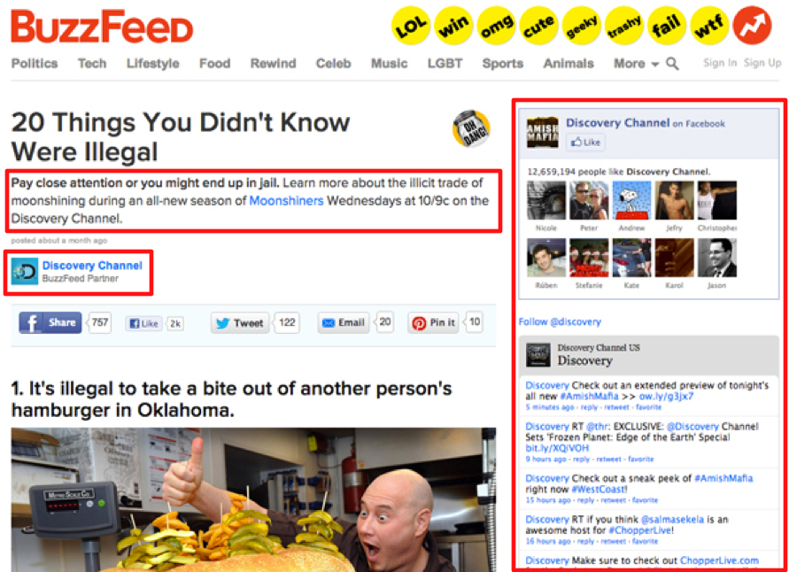
It's seen as unethical due to many dishonest and misleading headlines. Publishers also receive backlash.Image result for buzzfeed ads
Targeted advertising
 It's easier to target people, this is done by;
age
gender
interests, etc
 Limiting the privacy factor, many people dislike that, An example of targeted advertising would be found on Facebook, on the right side of the user's profile, the targeted advertisement would usually be linked into their interests or their recent searches e.g if they're getting ready for a wedding, the adverts would be of "bridesmaid dresses" or something like that
Shoppables and Influencers
 The products would sell faster because Instagram is a very popular app. Some people don't trust Instagram, etc An example of this would be Instagram, where it has shoppables.Image result for shoppable instagram

Tuesday, 26 September 2017

Changing platforms, advertising and audience - individual/group

1. To summarise the article, the answer is simple; Newspapers were once important, however the internet soon took over and people have been influenced by it, so they don't like them anymore. However, people tried to come up with new ideas, such as native advertising.

2. What is native advertising, branded content and targeted advertising?

Native advertising: When an advert is made to look like the content.

Branded content: The content is within the brand.

Targeted advertising: When the music video has the product in it, e.g the singer is holding the product. 


MagicBroom Advert Analysis.

MagicBroom Advertisement Analysis

At the start, the advert opens up with a clear mis-en-scene; a girl walking into a restroom, with a use of long shot, this is significant because it denotes what the girl is wearing and we can also see what the background behind her is, and we can also hear the diegetic sound as well. Further, the camera is then zoomed into the trash (or it could also be a close-up), which was one of the props for the advert, this again, is significant because it emphases how dirty the restroom is, and this is when the product comes in; MagicBroom, the reason as to why it's called MagicBroom is because we originally got the idea/theme from Harry Potter, as the advertisement was of a broom, we linked the broom with the movie Harry Potter, hence we wanted to make the advertisement magical, which connotes the significance of the product, as well as it increases the ethos, which means credibility; product's worth. Moreover, the angles in this advert is only at eye level, which the camera is placed at the subject's height, making it look completely neutral. 

Tuesday, 19 September 2017

MagicBroom!


Persuasive Techniques.

Persuasive Techniques.


Ethos - Credibility.

Logos - Logic; facts and figures.

Pathos - Emotion; most powerful, trying to connection with the buyer on an emotional level.

Humour.
Celebrity.
Repetition.
Reward - physical or psychological.
Punishment - This is often done quite subtly, suggesting to an audience that, if you don't own a particular object that they are selling, something particularly bad will happen to you, this is also a form of manipulation.
Bandwagon - Enjoying the product everyone is using, makes the person jump onto the bandwagon and buy the product.
Experts - By enlisting an 'expert' to sell the product, can give a brand credibility.
Emotional appeal - seek positive, warm emotions.
Testimonial - 'The man on the street' can also give credibility to a brand.


Maybelline Brow Fiber TV Advert Analysation.


Maybelline Brow Fiber Tv Advert.
This advertisement opens up with a mid-shot, which means we can see the model from the waist up. In the mis-en-scene, we can clearly see that the model is wearing black, the colour code convention of black connotes dominance and power, which signifies that the product is making the model look quite superior, and then hence, it’d make its demographic audience (female, ages between 15-21) look powerful. Further, as the advertisement goes on, a use of a close up shot is denoted, the eyes of the model are shown, whilst everything else is blurred, this can also be a use of depth of field shot, where everything is blurred out, except for one certain object – in this case, the model. The use of this close up shot and depth of field shot, connotes the use of the product and it reveals its results more clearly. Furthermore, one shot is completely in black and white, however the area where the object is used, is in a full, golden colour, again, the significance of this colour code convention, holds connotations of elegancy, power, wealth, etc, which again, could signify the products worth and results. There is also a use of reward - a persuasive technique, so if a person was to buy it, they'd be rewarded appearance-wise, with a further use of statistics; "Britain's number one", meaning that the product is of very good quality, which comforts to the use of it's ethos, making the product very valuable and worthy of use. The use of soundtrack in this advertisement is not heard as much, this may be because there is a narrator, telling the audience how worthy and good the product is, trying to persuade them into buying it. However, the soundtrack is quite dominant-sounding, it's the type of soundtrack that would make the audience feel powerful as they walk down the street.